Custom Colors for Brembo and Rim Emblems: Matching Your Build
Custom colors for Brembo and rim emblems look amazing when the caliper color, wheel finish, and center badge all pull in the same direction. I learned that standing next to a gray coupe with bright yellow calipers, blue wheel centers, and bronze lug bolts, and the car looked like it got dressed in the dark. The parts were all expensive. The result still felt wrong. That is the whole game with wheel color, you are not just picking a cool color, you are building one clean sentence people can read in a second.
Last week I was wiping brake dust off a set of satin black wheels and the owner asked me the question people usually ask too late, should the rim emblem match the Brembo caliper exactly. My answer was no, not always, and that usually surprises people. Exact matches can work, but they can also make the wheel feel heavy, busy, or weirdly fake. Most clean builds look better when the center emblem echoes the brake color, supports it, or calms it down.
There is a good reason this matters more now than it used to. BASF says neutral paints still hold a huge share of the car market, with gray strengthening, black staying strong, and white still massive even as it slips a bit. BASF also says green is gaining ground in EMEA and other regions, which means cars are getting a little braver, but most of what you see in a parking lot is still some version of white, gray, black, or silver. On neutral paint, a caliper or center emblem carries a lot of visual weight, so a bad color choice shows up fast.
Brembo knows color is not just for show either. On its official site, Brembo says it started producing colored calipers in the early 1980s, and that it now makes calipers in more than 40 colors. Brembo also says it does not offer every color because some pigments do not hold up well against light, weather, or rising temperatures. A color that looks cool on your phone is useless if it goes chalky, weird, or washed out once the car sees heat and sun.
Start with the caliper, not the sticker
I see people do this backward all the time. They find a fancy wheel emblem first, then try to force the rest of the wheel package around it. The caliper should lead, because it is the biggest color hit behind the spokes and it already has real visual authority. Once that color is set, your center emblem gets one job, make the wheel look intentional.
I use three simple paths when I match a center emblem to Brembo calipers.
Echo the caliper. Use the same color family in the emblem, but in a smaller dose. Red caliper, tiny red accent in the center badge. Yellow caliper, small yellow ring or detail.
Calm the caliper. Let the emblem stay black, silver, carbon look, or body color inspired while the caliper does the talking. This works great when the brake color is already loud.
Bridge the build. Pull a second color that already exists on the car, maybe gloss black trim, brushed silver trim, or bronze hardware, and let the emblem connect the wheel to the rest of the body.
That third path is the one most people miss. They stare at the brake, stare at the center cap, then forget the rest of the car exists. Window trim, mirror caps, roof rails, lip pieces, lug bolts, and even valve caps can help your eye accept the wheel as part of the whole car. When that rhythm is there, the build feels planned. When it is missing, the wheel looks like a sticker pack exploded on it.
Color theory without the art school headache
You do not need paint charts taped to your garage wall. You just need a few basic color moves and a little self control. Adobe explains the useful part in plain English, complementary colors sit opposite each other on the color wheel and create the strongest contrast, analogous colors sit next to each other and feel easier on the eye, and monochromatic setups use shades of one base color. Adobe also warns that if two colors fight at the same value, they can look harsh and hard to read, which is exactly what happens on busy wheel centers.
Here is how that plays out on a car.
Monochrome is the safe bet. Black caliper, black emblem, black trim, done. It is clean, easy, and hard to mess up.
Analogous is the smart enthusiast move. Blue car with blue caliper and a cooler silver blue badge accent. Green body with bronze or yellow green hints. Smooth, rich, not loud.
Complementary is the risky fun move. Blue and orange. Red and green. Yellow and violet. Great when done with restraint, terrible when the tones are too bright or too equal.
Neutral plus one accent is my favorite for daily cars. Gray body, black wheel, red caliper, mostly black emblem with a small red hit. You get drama without clown shoes.
That last one works because the eye needs a place to rest. A wheel already has a lot going on, spokes, brake dust, lug holes, reflections, tire texture, shadows, all of it. Add two or three loud colors in the middle and your eye starts to panic a little. The wheel stops looking premium and starts looking noisy.
The color combos I trust most
I keep coming back to a few combos because they work on real cars in real light, not just in edited photos.
Red Brembo calipers with black or carbon look rim emblems. This is easy. Red already carries years of performance history with Brembo, so the center just needs to support it. Brembo itself calls red calipers a trademark tied to exclusivity and performance.
Yellow calipers with gloss black centers. Yellow has punch. Black gives it a frame. This setup looks sharp on white, gray, blue, and silver cars.
Black calipers with brushed silver or smoked centers. Quiet, expensive looking, and hard to get tired of. Great for modern German builds and stealth setups.
Bronze or copper wheel hardware with warm center details. This is money on green, white, and dark gray cars. BASF says green is rising in EMEA, and warm metallic accents pair with it beautifully when the finish stays controlled.
Blue calipers with silver, black, or tiny orange accents. The silver version feels OEM clean. The orange version is the one you use when you want a little attitude and you know when to stop.
The combo I trust least is exact color on everything. Red caliper, red emblem face, red lug covers, red stripe, red valve cap, red logo, no thanks. That setup can work on a show car with a very tight vision. On a street car, it usually looks like you tried too hard on a Tuesday night and got emotionally attached to the color red.
Finish matters as much as color
Gloss red and satin red are not the same mood. Brushed silver and mirror silver are not the same mood. A smoked dome over a black print reads calmer than a bright gloss print, even if the base color is technically the same.
That is why I like looking at How It’s Made before choosing a badge finish, because the dome changes the way light hits the emblem. A clear dome adds depth and gloss, and that can either help your color look richer or make it feel louder than you expected. If you want a clean wheel, you are choosing both a color and the way that color catches light. That second part matters.
I also tell people to think about distance. From six inches away, metallic sparkle and tiny print details look fun. From six feet away, all you really read is contrast, size, and finish. That means a center emblem should not fight the spoke shape or the brake color. It should lock the middle of the wheel together and make the whole thing look finished.
The four mistakes that make a build look cheap
I have made some of these myself, so I am trying to save you the same pain.
Using too many colors in one wheel. Pick one star color, then let black, gray, silver, or carbon do support work.
Matching the body paint too literally. Exact body color on the wheel center often looks toy like unless the whole build is designed around it.
Ignoring wheel size and spoke openness. A bright caliper on a dense wheel barely shows. A bright caliper on an open spoke wheel becomes a huge visual event.
Forgetting the center cap size and fit. Even the best color plan dies if the badge is off by a millimeter and sits awkward in the middle.
That last point matters more than people think. If you need a refresher, read How to Measure Your Wheel Center Cap for a Perfect Sticker Fit before you buy anything. Good color on a bad fit still looks bad.
How I build a clean color match in five minutes
When I am helping someone choose, I run a stupid simple check. It works because it forces the wheel to act like one piece instead of five random upgrades.
Look at the body color and call it neutral, cool, or warm.
Look at the wheel finish and call it dark, bright, or metallic.
Decide if the caliper is the hero or just a support accent.
Give the center emblem one job, echo, calm, or bridge.
Remove one color from the plan before you order.
That last step is the sneaky one. Most builds improve when you subtract, not when you add. If the car already has a loud caliper, the center emblem should usually get more disciplined. That is why a lot of people end up happiest with a simple domed center and one small color detail. You can browse options in Shop All Products.
Do not let a bad install ruin a good color choice
A clean color plan still needs a clean install. The cap has to be flat, smooth, and actually clean, not just shiny looking. If there is wax, tire dressing, old glue, or brake dust trapped around the edge, the emblem can lift early and your nice color match turns into a sad peeling sticker that flaps every time you wash the car. Impossible Stickers also says domed wheel emblems work best on flat, smooth surfaces, which is the rule that saves people money before they order the wrong thing.
That part is not guesswork. Why Your Wheel Stickers Keep Peeling Off lays out the big reasons, and the pattern is the same every time, dirty surface, curved surface, cold install, or a badge that is just a hair too big. Good color decisions should age well. Bad prep makes them die young.
My install rule is boring and it works. Clean the landing zone, dry fit the badge, line up the logo, press from the center out, and go around the edge like you mean it. Then leave it alone. People love ruining fresh adhesive by poking it every ten minutes like it is bread in the oven.
What I would do on real builds
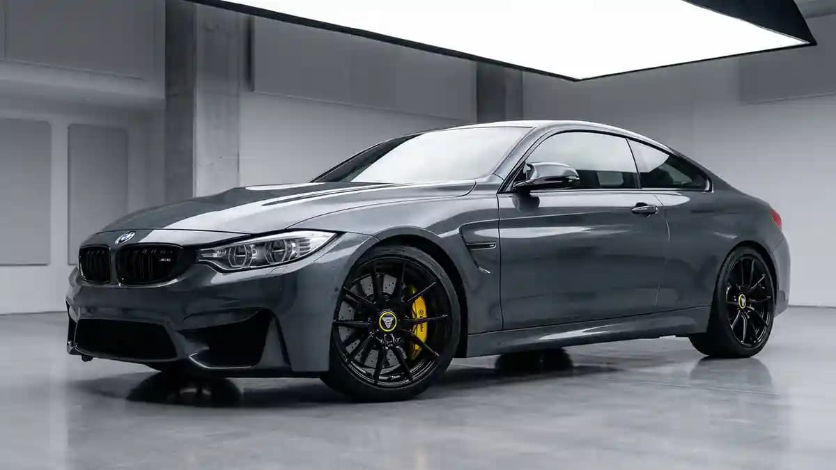
Gray car, black wheels, red Brembos. I would run mostly black custom rim emblems with a small red detail or a smoked gloss finish.
White car, silver wheels, yellow Brembos. I would go gloss black or silver center with a tiny yellow ring, not a full yellow face.
Dark green car, bronze wheels, black calipers. I would keep the center mostly bronze and black, with no extra bright hit at all.
Blue car, gunmetal wheels, blue calipers. I would use black and silver in the center, then let the caliper own the blue.
Black car, black wheels, black Brembos. I would still keep some contrast in the center, maybe gloss on satin, smoked clear, or dark carbon look, because total blackout can erase the shape.
That is the deeper point here. Matching your build is not about making every part the same. It is about giving each part a role and making sure none of them try to be the lead singer at once.
Quick Q and A
Q: Should rim emblems match Brembo calipers exactly?
No, not by default. Exact matches can work, but most daily builds look better when the emblem supports the caliper instead of copying it at full strength.
Q: What is the safest color combo for a street car?
Black, silver, carbon look, and one strong accent color are the easiest to live with. They stay clean looking and age well.
Q: Are bright colors harder to pull off on wheel centers?
Yes. The smaller the part, the easier it is for a loud color to look cheap. Bright works best as a small hit, not the whole face.
Q: Does the dome change how the color looks?
Yes. A clear dome adds depth and changes the way light hits the print. That can make the color feel richer, darker, or more intense depending on the finish under it.
Q: What matters more, color or fit?
Fit first, color second. A perfect color on the wrong size cap still looks wrong every single time.