JDM Slap Stickers: The 2026 Guide to Night Runner and Kanjozoku Style
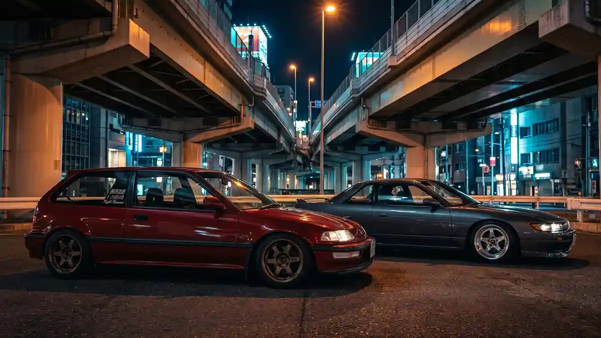
JDM slap stickers in 2026 look best when they feel earned, not thrown on the car like a kid attacked it with a sticker sheet. That is the answer to this title right away. Night Runner and Kanjozoku style can make a street build look sharp, mean, and personal, but only when the design has taste, the placement makes sense, and the wheel emblems fit like they belong there. I learned this after watching a clean old Civic go from serious to silly because one giant decal screamed louder than the whole car.
What Kanjozoku style actually means
Kanjozoku style comes from Osaka car culture, and it carries a rough street feel that people still copy because it looks raw, tight, and full of attitude. Kanjozoku describes Kanjozoku as an Osaka car subculture with roots going back to the late seventies, while MotorTrend ties the scene to Honda fans running around the Kanjo Loop for decades. I am not here to praise illegal street racing, because that is dumb, costly, and not worth a hospital bill. The useful part is the visual code, small cars, strong graphics, wheel detail, and crew style that looks like it has a reason.
The 2026 version should borrow the look, not the bad choices. You can love Osaka inspired graphics and still drive like an adult with bills. You can run a Night Runner decal and still use your turn signal, what a wild idea. The trick is to take the mood and make it clean enough for a real street car.
Here is the version that works now.
One main idea for the whole car.
Simple colors that match the paint and wheels.
Strong wheel centers instead of random door clutter.
Text that means something real.
Enough blank space so the car can breathe.
Most people mess up number five. They treat the car like a fridge at a tourist shop. Every empty spot feels like a place to slap one more thing. Then the whole build starts looking like it lost a fight with a gift bag.
Why Night Runner decals still work in 2026
Night Runner decals still work because the mood is easy to read. Dark street, low car, sharp wheels, clean glass, one strong mark. That image hits fast, and it does not need much text to explain itself. Current JDM sticker culture pieces still describe decals as identity, loyalty, and build story, not just decoration.
But a Night Runner decal only works when the rest of the car agrees with it. Put it on a clean black Nissan with gunmetal wheels and it can look serious. Put it on a stock grocery car with six other joke stickers and it starts looking confused. The decal did not fail, the plan failed.
I use this quick check before I add one.
Does the car already have a clear style.
Does the decal match the wheel finish.
Does the phrase fit the build.
Would it still look good after the trend cools down.
That last one saves money. Trends move fast, but a good car with clean small details ages better. Loud stuff gets old by Tuesday. Ask me how I know, I once thought a giant windshield graphic was a personality trait.
The slap sticker trap
Slap stickers are fun, and that is part of the problem. They are cheap, easy, and addictive. You buy one, then three, then suddenly your rear quarter glass looks like a gas station bathroom door. It happens slowly, then all at once.
The main trap is thinking more stickers means more style. It does not. More stickers means more noise unless each one has a job. A good JDM slap sticker should say something about the car, the driver, the wheels, the crew, or the mood.
Before you place one, ask this.
What does this sticker add.
What does it fight with.
Is the font right for the car.
Am I adding it because the build needs it, or because I am bored.
Bored is expensive. Bored buys neon valve caps at midnight. Bored orders eight decals and then acts shocked when the car looks like it has a fever. Go slow and the car will thank you.
Why domed badges beat flat vinyl on wheel centers
Flat vinyl can look good on glass, toolboxes, laptops, and some body panels. I am not here to bully flat vinyl, it has its place. But wheel centers are different because they sit in the middle of the wheel and pull the eye every time the car stops. A flat sticker on a wheel cap can look thin if the rest of the wheel has depth, gloss, and metal around it.
That is where 3D domed badges make more sense. A dome gives the graphic a raised lens, a smooth shine, and a small edge that catches light. It turns a sticker into something closer to a badge. Impossible Stickers product pages list a premium vinyl base, a 3D domed resin coat, sizes from 20 to 120 mm, plus scratch resistant, waterproof, tear resistant, and UV resistant features.
This matters for JDM builds because old wheels are rarely perfect. Some caps are faded. Some are scratched. Some have logos that look like they survived a small kitchen fire. A good dome gives the center a clean face again.
The right cars for this look
Some cars wear JDM slap stickers like they were born for it. Others need a lighter touch. A Civic hatch, an Integra, an old Corolla, a Miata, a Silvia, a 350Z, or a clean Subaru can usually carry the mood if the design is honest. A giant SUV with fake kanji on the fuel door, not so much.
Honda is the easy starting point because Kanjo style and Civic culture are tied close in people’s minds. A small red detail, black and white text, and clean Honda wheel emblems can make the car look focused without turning it into a sticker bomb. Nissan builds often look better with darker tones, brushed silver, and tight wheel branding, so the Nissan wheel emblems section is a good place to think through the vibe. Toyota can go TRD, old race car, or quiet street style, and the Toyota wheel emblems page gives you enough directions without forcing one answer.
Wheel brand matters too. A clean Advan wheel emblem on the right rim says more than five random body decals. A Toyota TRD domed sticker works when the car already has that Toyota race feel. Use logos like signatures, not wallpaper.
How to choose the graphic style
This is where people either get smart or go full raccoon in a shiny trash pile. You need one lane. Not three. Not four. One.
Pick from these routes.
Osaka inspired street style, simple white text, black base, tight sizing.
Night Runner style, dark tones, small rear glass hit, moody wheel centers.
Old JDM race style, red accents, block type, wheel brand focus.
Kanji detail style, one real phrase, no fake nonsense.
Stealth style, black on black, gloss over matte, almost hidden until light hits it.
The kanji part needs care. Do not use random characters from an image search just because they look cool. That is how you end up with something that says soup spoon on your quarter glass. Ask someone who can read it, check the meaning, and keep it short.
Placement rules that save the build
Placement is taste in public. You can buy a great decal and still ruin it by putting it in the wrong spot. I have seen perfect artwork die on a bad surface because the owner placed it like he was swatting a fly. Painful stuff.
Start with the parts people notice first.
Wheel centers.
Rear quarter glass.
Rear glass corner.
Small interior detail.
Do not start with the hood. Do not start with the door. Do not start with a huge side graphic unless the car has a full livery plan and the wheels already support it. Start small, walk back, squint like an old man judging paint, then decide.
Wheel centers are first because they make the rest of the car feel complete. They sit in the middle of the wheel, so a clean emblem makes the wheel look chosen instead of thrown on. If you want the deeper why, the older JDM Style Guide walks through how small custom emblems carry the Night Runner feel without copying the reckless part. It is the same lesson again, small details win.
Sizing is where the garage gets quiet
Wrong size kills the whole thing. A 1 mm gap can look cheap. A 1 mm overhang can look worse because the edge has nowhere to sit. That tiny mistake will follow you around the car like a mosquito with a grudge.
Measure the real landing zone, not the full plastic cap. The visible flat circle is the part that matters. If the edge curves down, do not count it. If the surface is dished, be careful with thick domes because the edge can lift.
This is my simple process.
Remove one center cap if you can.
Clean the face so grime does not fool your eye.
Measure the visible flat circle in mm.
Choose exact size for a flat face.
Go 1 mm smaller if the edge rolls or the fit looks tight.
Dry fit before peeling the backing.
The perfect sticker fit photo guide is worth reading before you order because it keeps you from guessing. Guessing feels fast. Reordering feels slow. Funny how that works.
Color choices that do not look cheap
JDM style does not need ten colors. Most good cars use two or three. Paint, wheel finish, and one accent is enough. If you add more, you better have a strong reason.
Here are the safe combos I trust.
White car, bronze wheels, red and black details.
Black car, gunmetal wheels, white text, tiny red accent.
Silver car, polished wheel lip, black and brushed silver badges.
Blue car, white wheels, small red mark.
The finish matters as much as the color. Gloss catches light and looks great on wheel centers. Matte can work on glass and body details. Brushed metal looks clean on darker wheels, while chrome can get loud fast if the car is not already built for it.
When in doubt, make the wheel emblem nicer and the body sticker quieter. That rule has saved more cars than I can count. The wheel can handle a little shine because it already has shape. The body panel turns flashy fast, like a guy wearing sunglasses indoors.
Install tips for 3D domed JDM badges
The install is simple, but simple does not mean careless. Most sticker failures start before the sticker touches the car. Wax, tire shine, brake dust, water, cold surface, all of that can mess with the bond. You do not need magic, you need patience.
Do this instead.
Wash the cap.
Dry it fully.
Wipe the landing zone with isopropyl alcohol.
Line up the badge before peeling.
Press from the center outward.
Avoid washing for at least one day.
If the garage is cold, warm the cap a little first. Not hot, just comfortable. A cold cap makes adhesive act lazy. Nobody likes lazy adhesive, it quits first and complains later.
Also, do not keep touching the edge after install. I know the urge. You want to poke it like a proud parent checking a sleeping baby. Leave it alone and let the adhesive do its job.
What I would avoid
I would avoid fake aging first. A brand new sticker made to look fake old can work on a ratty track car, but on a clean street build it often looks like you bought a costume. I would also avoid huge random Japanese text unless the phrase is checked and the car has the presence to carry it. Big graphics need big discipline.
Stay away from these mistakes.
Random characters you cannot read.
Mixed fonts on one small car.
Sticker packs with no theme.
Wheel badges that are too large.
Domes on surfaces with no flat support.
That last one matters. You do not need to write a school report on your windshield, but you should know what you are using. Respect makes the design better. It also keeps you from becoming the guy with soup spoon on his car.
Quick Q and A
Q: Are JDM slap stickers still cool in 2026?
Yes, when they match the car and mean something. They look bad when they are random, too large, or stacked with no plan.
Q: What is the best place to put a Night Runner decal?
Rear quarter glass is usually the safest place. It adds mood without taking over the car.
Q: Are domed badges better than flat vinyl for wheel centers?
For flat wheel caps, yes. The 3D dome gives more depth, shine, and a more badge like look than plain vinyl.
Q: Can I use Kanjozoku style without copying illegal street racing?
Yes. Borrow the visual language, not the dangerous behavior. Keep it as design, car history, and street style, not a driving plan.
Q: How do I avoid ordering the wrong wheel emblem size?
Measure the visible flat circle in mm. If the edge curves or the fit looks tight, choose 1 mm smaller for a cleaner sit.
Q: What color works best for JDM Night Runner stickers?
Black, white, red, gunmetal, and brushed silver are the safest choices. Pick one accent color and stop before the car starts shouting.
Final take
JDM slap stickers work best when they feel like part of the build, not an afterthought stuck on during a snack break. Night Runner and Kanjozoku style have real visual weight, but they need restraint, meaning, and clean fitment. Start with the wheel centers, choose one theme, size everything in mm, and let the car carry some empty space. Do that, and your build looks sharper before you even touch the engine.