
Safety Labels and Compliance: Making Emergency Labels Impossible to Ignore
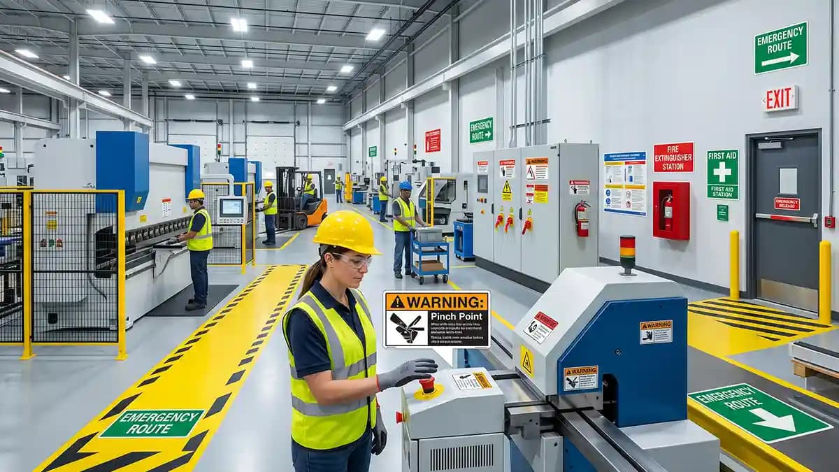
Safety labels only work when people notice them before the mistake happens, and that is the whole point of making emergency labels impossible to ignore. I was standing in a workshop last month, looking at a faded warning stuck beside a red shutoff switch, and nobody in the room could read it from five steps away. That is not a label. That is a tiny lie pretending to help. In a real panic, nobody squints politely.
Emergency labels have one job, stop the wrong action fast. They do not need to look fancy, but they do need to look clean, loud, and trusted. OSHA rules for accident prevention signs cover how hazards and safety instructions should be shown, including color expectations for caution and safety instruction signs. ISO safety sign rules point the same way, using shape, color, and symbols to help people understand risk without needing a long speech.
Why most bad safety labels fail
Most weak safety labels fail for boring reasons. The print fades, the corner lifts, the icon is too small, or the wording sounds like it was written by a committee trapped in a basement. I have seen labels placed behind handles, under dust, above eye level, and on dirty metal that looked like it had been wiped with a sandwich. Then someone acts shocked when workers ignore them.
Here is what kills a warning label fast.
The label blends into the machine color.
The text is too small for the distance.
The icon does not match the hazard.
The surface is greasy before install.
The material curls at the corners.
The warning gets wiped, scratched, or sprayed until it looks tired.
The label uses too many words, so nobody reads it.
That last one hurts people more than they think. In a rush, your brain grabs shapes and colors first. Then it reads the words. If the label asks the reader to study it like a school test, it already lost.
What safety labels need to say fast
A strong safety label answers three questions. What is the danger? What should I do? What happens if I ignore it? That sounds simple because it is simple, and simple wins when noise, stress, gloves, forklifts, alarms, and bad lighting all show up at the same time.
For chemical hazards, OSHA hazard communication rules use label elements such as pictograms, hazard statements, signal words, and precautionary statements. OSHA also says hazard communication pictograms use a black symbol on a white background with a red frame shaped like a square turned on its point. That is not random art. It is a visual shortcut, and shortcuts matter when people have two seconds to make the right choice.
A good emergency decal keeps the message short.
Danger, high voltage.
Emergency stop.
Wear eye protection.
Keep hands clear.
Fire extinguisher.
First aid.
No open flame.
Shut off before service.
See the pattern? No poetry. No cute slogan. Just the thing people need to know.
Why 3D doming helps high visibility warnings
Flat stickers can work fine in calm places. A clean office label on a drawer does not need armor. But emergency labels near machines, tools, panels, valves, and storage zones live a rougher life. They get touched by gloves, hit by boxes, cleaned with sprays, rubbed by sleeves, and ignored by Gary from shipping who somehow always parks the pallet jack in front of the one thing everyone needs.
That is where 3D doming earns its keep. A clear raised resin layer sits over the print and helps protect the design from daily wear. It also adds depth, so colors and icons look stronger from an angle. If you want to see how the printed vinyl, cut shape, clear dome, curing, and final check come together, the How It’s Made page shows the basic process in plain steps.
The dome does three useful things for safety labels.
It protects the printed warning from rubbing and light scratches.
It adds a raised feel, so the label feels important, not cheap.
It makes color and symbols look deeper under light.
It helps small icons stand out on busy equipment.
It gives the label a finished look that people trust.
That trust part matters. A peeling label says, nobody cares about this machine. A clean domed label says, pay attention, this is here for a reason.
Where emergency decals make the biggest difference
Not every surface needs a raised label. I would not put a thick dome on a paper binder and call it genius. That is like wearing a motorcycle helmet to eat soup. But for hard gear that gets handled every day, domed emergency decals can make sense.
Use them where labels need to stay clear and visible.
Emergency stop buttons on machines.
Electrical panels and breaker boxes.
Control panels with many similar buttons.
First aid cabinets.
Fire safety stations.
Forklift charging areas.
Battery storage zones.
Compressor rooms.
Chemical storage doors.
Tool lockout areas.
Maintenance covers.
Industrial carts and mobile equipment.
This is also why control panels deserve extra care. When every button looks the same, the label becomes part of the control system. The post on control panel overlays goes deeper into the raised touch benefit, and that same idea helps safety markers too.
The color rule I never fight
Color is not decoration in safety work. Color is a code. Red tells people to stop, danger, fire, or prohibition. Yellow warns them to slow down and watch the hazard. Blue tells them something is required, like eye protection. Green points to safe condition items, exits, first aid, or emergency help.
ISO 7010 covers registered safety signs for accident prevention, fire protection, health hazard information, and emergency evacuation. It also ties sign shape and color to ISO 3864 principles. So when someone says, can we make the warning label dark gray because it matches the machine better, I say no. The machine does not get a vote when a hand is near a pinch point.
Use color with discipline.
Red for stop, danger, fire, and do not do this.
Yellow for warning and caution.
Blue for required action.
Green for safe route, first aid, and emergency help.
Black and white for contrast and readable text.
The wrong color makes people think longer. Thinking longer is fine when choosing pizza. It is not fine near a moving blade.
Keep the words stupid clear
I love nice design, but safety labels are not a place to show off. The best warning text feels almost too blunt. That is the point. A tired worker at the end of a shift should understand it without reading it twice.
Here is the little test I use.
Can I read it from the real viewing distance?
Can I understand it in one glance?
Does the icon match the danger?
Is the action clear?
Is the result clear if I ignore it?
Does the label still work if the reader speaks another language?
Is the font clean enough for dusty, bright, or dark areas?
If the answer is no, fix the design before printing. Do not ask the material to save a bad layout. A shiny dome over confusing text is still confusing. It just becomes confusing with a nice hat.
Surface prep decides if the label stays
This is the part nobody wants to hear, because it is not fun. The best label in the box can fail if you slap it onto oil, dust, powder coat texture, or cold plastic. Adhesive likes clean, dry, smooth surfaces. It hates grime like a cat hates bath time.
Before you apply compliance stickers, do this.
Clean the surface with mild soap if needed.
Dry it fully.
Wipe the area with isopropyl alcohol.
Let the alcohol flash off.
Check that the surface is flat enough for full contact.
Place the label once, not five times.
Press from the center outward.
Give the adhesive time to bond before harsh cleaning.
That boring prep is where the whole job is won. People love to blame glue, but half the time the glue was asked to stick to grease, dust, and old regret.
When domed labels are not the right answer
Real talk for a second. Domed labels are strong, but they are not magic. They are not a substitute for correct safety procedures, approved signs, employee training, or a safety officer who knows the rules. Use them as part of the system, not as the whole system.
Skip domed labels in these cases.
On surfaces that get direct heavy impact.
On rough cast metal with deep texture.
On rubber that flexes hard every day.
On tight curved spots where edges cannot sit flat.
On hot surfaces beyond the label material limits.
On places where the raised edge can catch tools or clothing.
Over existing safety labels that must remain visible and approved.
That last one is big. Do not cover required warnings just because they look ugly. Replace them correctly, or add a new label nearby if your site rules allow it. Safety is not the place to play sticker Jenga.
Custom safety labels for messy real jobs
Custom safety labels shine when the job is too exact for a stock sign. Maybe your machine has a special shutoff order. Maybe your team uses color coded carts. Maybe your electrical panel needs a warning in two languages. Maybe you need emergency decals for gear that moves between sites and gets handled like luggage at an airport.
That is where custom domed stickers make sense. You can match the size, shape, icon, wording, and finish to the real surface. The goal is not to make a pretty sticker. The goal is to make the right warning land in the right place and stay readable.
For larger teams, shops, factories, clubs, fleets, and equipment makers, Wholesale and Bulk Orders is the smarter path. One label is easy. Fifty labels need repeat size, repeat color, repeat shape, and repeat quality. That is where clean production beats guessing.
The asset tag lesson
Safety labels and asset tags have a cousin relationship. Both need to survive real work. Both need to stay readable. Both fail when people treat them like throwaway paper.
The post on asset tags and traceability makes the same point from a tracking angle. If a barcode or serial label wears off, the item becomes a mystery. If a safety label wears off, the hazard becomes a surprise. And surprises near machines are usually bad.
A durable label helps with daily habits.
Workers see the same warning every time.
New staff learn faster.
Maintenance teams find controls quicker.
Audits look cleaner.
Equipment feels cared for.
Labels do not need constant replacement.
That last part saves time. Not glamorous time. Annoying time. The kind where someone walks around with a label sheet and mutters because three corners lifted again.
The simple design formula
Here is the formula I trust for high visibility warnings. Start with the hazard. Pick the correct color family. Use one strong icon. Use short wording. Add the action. Leave enough blank space so the message breathes. Then print it on material that fits the job.
The label should pass the tired worker test. Picture someone with gloves on, loud machines running, and a supervisor asking where the missing wrench went. Can that person still see the label and understand it? If yes, you are close.
My safety label layout checklist looks like this.
One message per label.
Big icon first.
Short words next.
Strong contrast.
No tiny text unless it is secondary.
No decorative font.
No low contrast color tricks.
No hiding the warning near clutter.
No placing it where hands cover it during use.
No cheap finish in a harsh area.
Simple design is not lazy. Simple design is respectful. It respects the worker, the machine, and the fact that emergencies do not wait for people to admire your layout.
Final thought before you print
Safety labels deserve more care than most people give them. A good emergency label is small, but it can change what someone does in a critical second. It tells the hand to stop, the eyes to look, the body to move, or the team to grab the right tool. That is not decoration.
The best compliance stickers are clear, tough, and placed where they get seen. The dome adds protection and presence, but the real win comes from the whole setup, correct message, right color, clean surface, smart placement, and steady production quality. If you want the finish to hold up, the Quality Promise is worth checking before you order. Tiny label, big job. Give it the respect it needs.
Quick Q&A
Q: Are domed safety labels compliant by themselves?
No. A label material does not make a workplace compliant by itself. The design, wording, color, placement, hazard type, local rules, and training all matter.
Q: Where should emergency labels be placed?
Place them where the person needs the warning before acting. Near the button, switch, valve, panel, cabinet, or hazard zone is usually better than somewhere neat but useless.
Q: Can 3D domed labels be used outdoors?
Yes, when the material, adhesive, and surface are right for outdoor use. Clean prep and full edge contact matter a lot.
Q: What is the best size for a safety label?
The best size depends on viewing distance and how much text is needed. If people read it from across a room, go bigger and keep the words short.
Q: Should safety labels use icons or text?
Use both when the hazard needs fast recognition. Icons grab attention first, and short text removes doubt.