Volkswagen Wheel Center Cap Sticker Guide for GTI, R, and R Line Builds
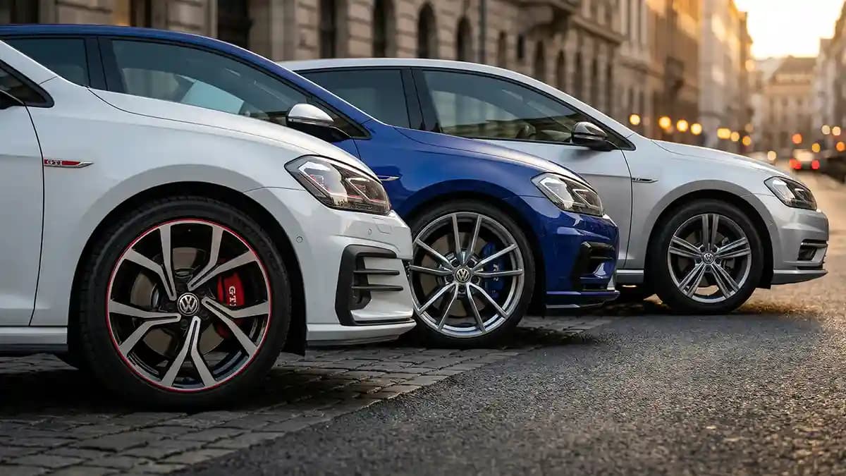
A volkswagen wheel center cap sticker should match the mood of your car, not just the bolt pattern, and that is the real answer to which style fits your build. GTI wants heat and a bit of mischief, R wants clean pressure and precision, and R Line looks best when the emblem stays sharp, simple, and factory looking. I learned this the hard way in a parking lot full of Volkswagens where every car had good wheels, but only a few had center caps that actually matched the build. One wrong logo, one loud color, and the whole wheel looked like it got dressed in the dark.
Most people shop these emblems backward. They start with the coolest badge they can find, then try to force it onto whatever wheel sits in front of them. Bad move. With VW stuff, the center cap is tiny, but it carries a stupid amount of visual weight. It is like the last button on a shirt, nobody talks about it until it is wrong, then it is all you can see.
The fast answer, which badge belongs on which build
When I am helping someone choose, I keep it brutally simple. You do not need a design degree, you need a filter that stops you from buying nonsense.
GTI build
Use red accents, sporty contrast, or a clean VW roundel that still feels lively.R build
Use blue accents, gloss black, brushed silver, or very clean monochrome designs.R Line build
Keep it restrained. Plain VW logos, gloss black, satin black, smoked clear, or subtle silver usually look best.Aftermarket wheel setup
Buy for the wheel face first, not the model badge. A great logo in the wrong size looks cheap in about three seconds.
I was standing next to a black Golf one evening, nice stance, clean paint, sharp wheels, the whole thing looked sorted. Then I got closer and saw giant bright red GTI style caps on a car that was dressed more like an R Line street build. It felt off right away. Not awful, not criminal, just wrong enough to itch your brain like a sock seam.
Why GTI emblems work when they work
GTI has always had attitude. Not fake aggression, not cartoon noise, just that very VW kind of confidence where the car looks like it knows a back road you do not. So when I pick a VW GTI center cap look, I want the emblem to carry some red, some contrast, and enough visual punch to match the rest of the car. A plain silver VW badge can still work, but it has to sit with the rest of the wheel design, not float there like it showed up late.
Here is when GTI style looks right to me.
Red brake calipers or red grille accents already exist on the car
The wheels have a sporty spoke pattern, not a soft luxury look
The paint can handle a hot accent, white, black, gray, silver, or red
The rest of the car already leans into GTI language, not stealth mode
And here is when I skip it.
Bronze wheels, because red can fight the warm metal tone
Heavy chrome builds, because GTI style wants sharper edges
Cars pretending to be five trims at once, because that never ends well
If you want the easiest safe move, a VW GTI badge emblem works best when the rest of the car already whispers GTI before the center cap says it out loud. Badge second, build first.
Why R builds need cleaner restraint
R owners mess this up too, just in a different way. They see performance and go full blackout goblin with every part on the car. Then the wheel center disappears into a dark hole and all the detail is gone. The Golf R look works because it mixes control with aggression.
That means your emblem choice needs to look tighter and colder than a GTI setup. Blue accents can work great. Gloss black can work great too. Smoked clear, brushed silver, and a crisp monochrome VW badge also fit the mood. What I do not like is fake race graphics or logos that scream before the car even starts.
I use this little rule for R style.
If the wheels are bright silver, go black or blue in the center
If the wheels are gloss black, use enough contrast to keep the logo readable
If the car already has blue trim cues, echo them lightly, do not flood the wheel with blue
If the build is very stealthy, smoked clear or satin black looks expensive
This is also why a normal VW wheel emblem still works on a lot of R builds. The wheel does not always need an R on its forehead. Sometimes the clean VW roundel looks tougher because it is not trying so hard. Weird but true.
Why R Line is where people get confused
R Line is the danger zone. Not because it is bad, but because people keep treating it like a full R car when it is really a style and trim language. That is where the wrong emblem choice sneaks in. You see the badge on the grille, get excited, and next thing you know the wheels are wearing logos that promise a level of madness the car never signed up for.
For R Line builds, I like center caps that sharpen the car without changing its identity. A standard VW logo is the easiest win. Gloss black on black works if the wheel design has enough light on the edges. Smoked clear can look really slick on gray or white cars because it adds depth without turning the wheel into a costume.
Here is the R Line sweet spot.
Factory VW roundel in a clean finish
Black and silver combo that matches window trim or mirror caps
A restrained custom emblem that does not copy GTI or R cues too hard
Carbon look only if the car already has carbon pieces elsewhere
R Line builds usually look best when the whole car feels tidy. Good gap lines, clean paint, crisp wheel faces, nice glass, nothing shouting over the rest. A loud center cap on that kind of build is like wearing football boots with a suit.
The one thing bigger than style, fit
Style sells the click, fit decides whether the car looks good in real life. I have seen perfect logo choices ruined by a sticker that was just a hair too large. The edge rides on the lip instead of the flat face, dust gets under it, and now the cap looks cheap every time the sun hits it. One millimeter does that.
That is why I always tell people to measure the flat visible circle, not the full cap, not the hole behind it, not the vague guess from a marketplace listing. Measure what the sticker will actually sit on. If the visible face is 65 mm, buy 65 mm only when the flat area truly gives you that room. If the cap has a bevel or curved shoulder, going 1 mm smaller usually saves your sanity.
That is why I keep sending people to Millimeters Matter: How to Use Digital Calipers for a Perfect Fit. A cheap ruler lies to you in a polite way. Calipers tell you the truth, even when you do not like it.
The VW wheel sticker 65mm trap
A lot of buyers search VW wheel sticker 65mm because it is a common shopping phrase and sometimes it is the right answer. But search phrases are not fitment proof. VW has used different wheels, different cap shapes, different face sizes, and different accessory parts across models and years. If you buy just because the number sounds familiar, you are gambling with tiny expensive circles.
What I do instead is simple.
Remove one cap if you can
Clean the face so you can actually see the edge
Measure the flat visible badge area in millimeters
Check whether the surface is fully flat or slightly domed
Buy exact size, or 1 mm smaller if the edge rolls away
And if your VW wears aftermarket wheels, all bets are off until you measure. The logo on the car does not control the size on the wheel. The wheel does.
Finish matters more than people think
A badge is not just the logo. Finish changes the whole tone. Same VW roundel, different finish, completely different car. I have seen a plain logo in smoked clear look richer than a busy custom badge with three colors and fake carbon all over it. Less drama, more class.
This is how I match finish to build.
Gloss black for black packs, dark wheels, and sharp modern builds
Satin black for stealth daily drivers that still need some texture
Silver and black for factory style wheels and clean OEM plus looks
Red accented for GTI builds with real sporty cues already on the car
Blue accented for R builds that want a nod to the factory mood
Smoked clear for gray, white, and silver cars where subtle depth looks rich
Carbon look only when carbon already appears elsewhere on the car
Match the wheel emblem to the trim language, then to the brake calipers, then to the paint. Not the other way around. Your eyes read the car as a whole before they read the tiny logo in the middle.
What I avoid every single time
Some choices fail so often that I do not even pretend they are personal preference anymore. They are just bad bets.
Fake GTI logos on cars that are built like plain commuter trims
Full R branding on soft R Line builds with no matching visual cues
Ultra shiny cheap domes that look yellow under sunlight
Stickers that sit over curved edges instead of flat faces
Too many colors inside a tiny circle
Unclear print with mushy edges, because blurry logos always look bargain bin
And I really avoid random cheap epoxy domes for wheel centers. A cap lives in heat, dirt, water, road salt, and car wash spray. That is not the place to get cute with bargain resin. If you want the ugly version of that lesson, read Epoxy vs. Polyurethane: The Science of Why Cheap Stickers Fail. It is basically a horror story told in circles.
The install part nobody wants to hear
You can buy the perfect emblem and still mess it up in five minutes. People rush this part because the sticker is small, so they assume the job is small. Nope. The wheel center is right at eye level when you crouch near the car, which means every bad alignment choice gets a front row seat.
My install routine is boring, which is exactly why it works.
Wash the cap first and dry it fully
Wipe the bonding area with isopropyl alcohol
Let the cap warm up if the garage is cold
Dry fit before peeling the backing
Align from straight on, not from a weird side angle
Press from center out
Leave it alone after install, no instant pressure wash victory lap
That last step saves a lot of pain. Fresh adhesive needs peace and time. Give it a calm start and it pays you back.
So which style fits your build
If your car is a GTI, lean into the red and the fun, but keep it clean. If it is an R, go colder, tighter, and more controlled. If it is an R Line, stay honest and stylish instead of chasing badges that belong to a different car. And if you still feel torn, a clean VW roundel from the VW collection is the safest move because it respects the build without overexplaining it.
That is usually where I land after all the overthinking. Not with the wildest emblem, not with the rarest one, just the one that makes the wheel look finished. When you get it right, the car looks more expensive, more cared for, and more complete. Tiny part, big payoff.
Quick Q and A
Q: Should a GTI always use a red center cap design?
Not always. Red is the easy home run, but a clean black and silver VW roundel can also look great if the wheels already carry enough GTI flavor.
Q: Can I use an R logo on an R Line build?
You can, but I usually would not. R Line looks best when it stays tidy and honest, unless the rest of the build already pushes hard toward full R style.
Q: Is VW wheel sticker 65mm the standard size?
Treat it like a search term, not a promise. Measure your actual flat cap face first, because VW wheel centers vary by wheel and year.
Q: What finish looks best on black wheels?
Gloss black, satin black, smoked clear, or a logo with just enough silver edge to stay visible. Full bright silver can work too, but only if the rest of the car has matching trim.
Q: Are domed emblems better than flat stickers for wheels?
For most wheel center builds, yes. A good dome adds depth, looks closer to a factory badge, and handles daily grime better than a cheap flat print.
Q: What is the biggest mistake people make with VW center caps?
Buying by model name instead of measuring the cap. The second biggest mistake is picking a loud badge that fights the rest of the build.