Porsche 911 Wheel Emblem and Cayenne Wheel Emblems, Full Color Crest or Monochrome?
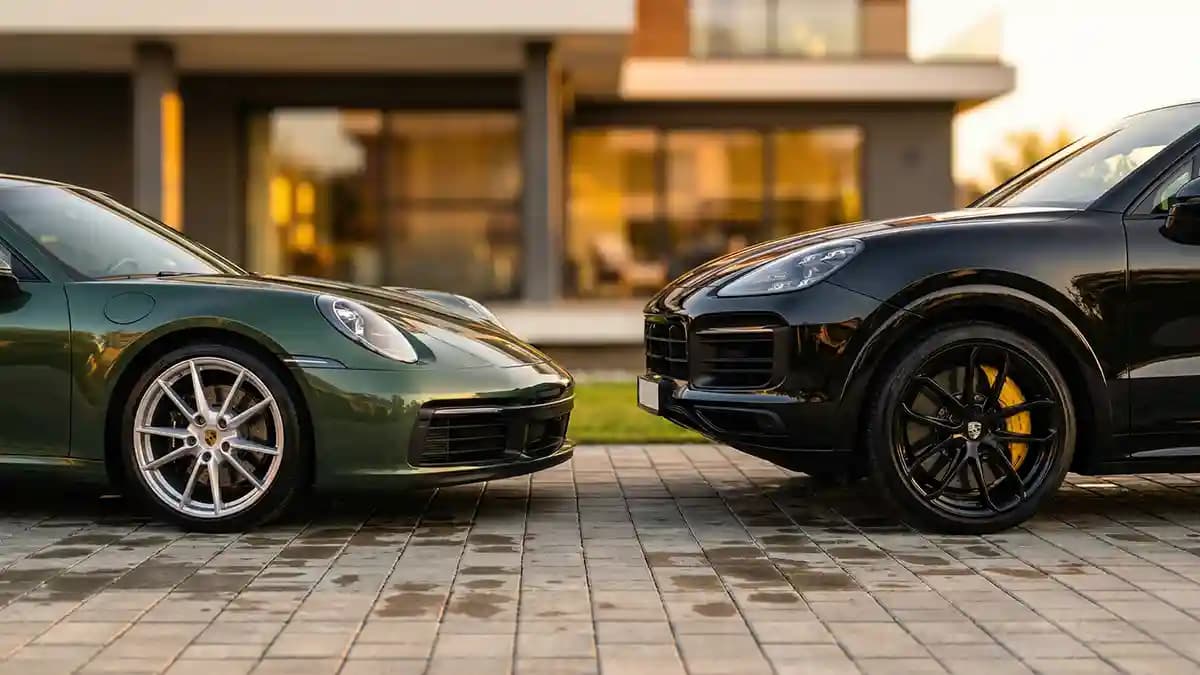
A Porsche 911 wheel emblem with the full color crest looks better on most 911s, and a monochrome badge usually looks better on the right Cayenne or on a blackout build, that is the honest answer. I figured this out the same way most car people do, by staring at parked cars longer than a normal adult should. One was a deep blue 911 with silver wheels that looked almost too clean to touch. The other was a black Cayenne on dark wheels that looked like it bench presses small buildings. The crest choice changed the whole mood of both cars.
Last week I was standing near a coffee shop lot, holding my own keys, pretending I was not comparing center caps like a complete maniac. The 911 had the colored crest, and every bit of the gold, red, and black tied the car back to what makes a Porsche feel like a Porsche. The Cayenne wore a dark center setup that looked mean, heavy, and sharp. Nothing about it wanted bright jewelry in the middle of the wheel. That was the little light bulb moment, the badge is tiny, but it can pull the whole wheel toward heritage or toward stealth.
Porsche has used its crest since 1952, and Porsche says the badge started appearing on hubcaps in 1959. Porsche also modernized the crest in 2023, but kept the basic color story and shape that people know on sight. So when you choose a full color wheel emblem, you are not just picking a louder finish. You are leaning into the part of Porsche design that has been baked into the brand for decades.
My quick answer before we get fancy
If your 911 has silver, satin platinum, or bright machined wheels, pick the full color crest.
If your 911 is a Heritage style build, classic style build, or anything with Fuchs energy, pick the full color crest.
If your Cayenne runs gloss black, satin black, or a full blackout trim theme, pick monochrome.
If your Cayenne has bright trim, lighter paint, or a luxury look more than an aggressive look, full color still works.
If you are split right down the middle, let the wheel finish make the call, not the body color alone.
Why the full color crest wins so often on a 911
The 911 is a car that gets away with tradition because tradition is half the magic. Even brand new 911s still look best when there is at least one detail that nods back to older cars, and the center cap is a cheap place to do that. A Porsche colored crest center cap looks right at home here, and Porsche Classic makes a big deal out of restoring the original crest and its color fidelity. Porsche still sells classic style hub caps with colored embossed crests for older 911 applications and for Fuchsfelge wheels. That tells me the colored crest is not old news, it is still the house favorite when Porsche wants the emblem to feel rich and proper.
I have seen people black out everything on a 911 and then wonder why the car suddenly feels a little cold. Not bad, just cold. A colored crest fixes that in about three seconds, because it puts a little life back into the wheel face. Gold warms up silver wheels. Red and black pick up brake hardware, trim, and darker paint. And the horse in the middle stops the wheel from looking like it belongs on some random tuner build from a parking lot at 11 p.m.
Here is where the full color crest really earns its keep.
It adds contrast without making the car look cheap.
It matches the heritage side of Porsche design better than a plain black badge.
It helps silver and two tone wheels look finished, not empty.
It photographs better, because the crest reads from farther away.
It makes the center cap feel like a badge, not just a filler piece.
Why monochrome looks so good on the right Cayenne
The Cayenne is different. Even when it is classy, it still has size, weight, and a bit of attitude built into the shape. Dark trim, tinted glass, black wheels, and big sidewalls give the Cayenne room to run a quieter badge without looking unfinished. If you are shopping a Porsche cayenne wheel sticker or overlay, this is usually the look that makes the most sense. Porsche has officially offered monochrome hub cap options on Cayenne applications, and its accessory finder for the current Cayenne says wheel hub covers can come with monochrome or coloured Porsche crests. So this is not some fake choice people invented on forums at two in the morning. Porsche itself has treated both looks as valid.
A Porsche monochrome badge works when you want the wheel to read as one shape first and a logo second. That is perfect for a Cayenne build with big spokes, heavy brake packages, or a gloss black theme. You get a cleaner visual center. You also avoid that little pop of color that can feel dressy on a truckish SUV. On the wrong wheel a black badge can disappear, sure, but on the right setup it looks expensive in a quiet way.
This is when I would choose monochrome on a Cayenne.
Black or dark gray wheels.
Paint colors like black, chalk, dark gray, or deep green.
Trim packages with lots of gloss black.
Winter wheel sets where you want a simple OEM plus look.
Builds where the body and wheel already have enough visual noise.
The wheel finish decides more than the badge color
This is where people mess up. They look at the badge art first, then the car color, and only after that the wheel itself. I do the opposite. The wheel face is the stage, and the emblem is just the actor trying not to trip over the furniture. If the wheel is bright, machined, silver, or has a lot of classic Porsche flavor, the full color crest almost always feels right. If the wheel is black, smoked, or trying to disappear into the tire and body trim, monochrome has a better shot.
The same rule works across both cars, but it hits harder on the 911 because wheel design is such a huge part of the car’s character. A classic looking wheel on a 911 with a black badge can look like you forgot the last step. A dark wheel on a Cayenne with a loud bright crest can feel like a tuxedo with neon socks. Not illegal, just a little weird. And once you see it, you cannot unsee it.
I keep it simple.
Bright wheel, bright crest.
Dark wheel, dark crest.
Heritage wheel, colored crest.
Stealth build, monochrome crest.
Mixed wheel finish, pick the crest that matches the trim around the windows and mirrors.
What Porsche itself quietly tells you
One reason this topic is fun is that Porsche does not force one answer. Porsche sells wheel hub covers with colored crests for current accessory lines, sells black high gloss covers with coloured crests for several modern applications, and Porsche Classic says classic hub caps are available in original design with full colour or black crest. Porsche also offers model specific fitments, like a 71 mm Fuchsfelge hub cap with coloured embossed crest. Read between the lines and the answer gets pretty clear, Porsche treats color as heritage and richness, and treats monochrome as a valid mood when the wheel and model support it.
That matters because it saves you from the fake argument that one choice is always more correct. No. More correct for what? For a silver 911 Carrera on classic style wheels, yes, I will push the full color crest all day. For a black Cayenne on black wheels with smoked everything, monochrome looks like it came from the factory after a strong espresso and bad intentions.
Fit still matters more than style
Now for the part that saves money. The prettiest crest on earth still looks bad if the size is off or the surface is wrong. Impossible Stickers makes this pretty clear on the Porsche pages and install guidance, the brand range runs from 20 mm to 120 mm with custom sizing available, and the emblems are meant for flat surfaces only. That last part matters a lot, because a curved cap with the wrong dome is where edges start acting dumb.
I would rather see a simple badge that fits perfectly than a fancy crest hanging over the lip by one sad millimeter. If you need a sizing refresher, read Millimeters Matter: How to Use Digital Calipers for a Perfect Fit before you order. And if you want more Porsche specific finish and size ideas, Porsche Wheel Center Cap Emblems: Colored Crests, Black Logos, and Custom Sizes is a solid next read. Both will save you from buying the right logo for the wrong part.
My fit routine is boring, which is why it works.
Clean the cap face well.
Measure the visible flat circle, not the outer lip.
Match the emblem to that flat visible area, or go 1 mm smaller if you want a cleaner edge.
Make sure the cap face is actually flat enough for a dome.
Press once, align once, stop touching it.
My picks for real Porsche builds
For a 911 Carrera, Carrera S, Targa, or anything that leans elegant, I pick full color almost every time. The crest brings warmth, depth, and that little bit of jewelry the 911 can carry without looking overdone. For a GT style build on satin dark wheels, I still lean colored unless the rest of the car is fully committed to the dark theme. The 911 has earned the right to wear the family crest proudly. That is part of the show.
For a Cayenne, I split it by mood. Luxury Cayenne, full color. Sporty or blackout Cayenne, monochrome. Winter set with dark wheels, monochrome again. And if you are trying to freshen up a tired set without replacing the whole cap, the Porsche collection is the clean place to start, then step into the Porsche Wheel Emblems Premium Edition once you know your size. Those are the kind of small fixes that make the whole car feel newer when you walk up to it in a parking lot.
And yes, I know this sounds obsessive. It is obsessive. But Porsche people notice details the same way chefs notice bad knives or guitar players notice tuning. The center cap sits right in the middle of the wheel like a target, so when it looks wrong, it pulls your eye every single time. Get it right, and the car feels sorted. Calm. Finished.
If you want my blunt answer, here it is. The full color crest looks better on most 911s. Monochrome looks better on the right Cayenne. When in doubt, trust the wheel finish, not your mood that day. Your car will thank you, even if it does not speak German.
Quick Q and A
Q: Does the full color crest look too busy on a modern 911?
No, not on most cars. The 911 still carries a lot of Porsche history in the shape, so the colored crest usually feels natural, not crowded. It is the safer pick if your wheels are silver, machined, or classic leaning.
Q: When does a monochrome Porsche badge look best?
It looks best on dark wheels, blackout trim, and builds where you want the wheel center to stay calm. Cayenne owners pull this off more often because the SUV shape can handle a heavier, stealthier look.
Q: Are colored and monochrome Porsche center caps both official looks?
Yes. Porsche accessory pages and Porsche Classic material show both coloured and monochrome crest options across different applications and eras.
Q: How do I know what size emblem I need?
Measure the visible flat circle on the face of the center cap. Do not guess by model name alone, because wheel options and aftermarket caps can change the answer fast.
Q: Can I put a domed emblem on any Porsche center cap?
Only if the surface is flat enough. If the cap face is heavily curved or textured, the edges can lift later, which is annoying and avoidable.
Q: What if I just want the easiest safe choice?
Pick full color for most 911s and monochrome for dark wheel Cayennes. That gets you close to right almost every time, then fit and finish do the rest.